
Understanding the Principles of the Colour Wheel
In the world of art and design, colours are like the building blocks of imagination. They have the power to evoke emotions, set moods and convey messages without uttering a single word. Just as a musician needs to understand the notes and scales and a writer needs to grasp the nuances of language, an artist or designer needs to comprehend the principles of the colour wheel. The colour wheel, a seemingly simple concept, holds the key to unlocking the full potential of visual communication and creative expression.
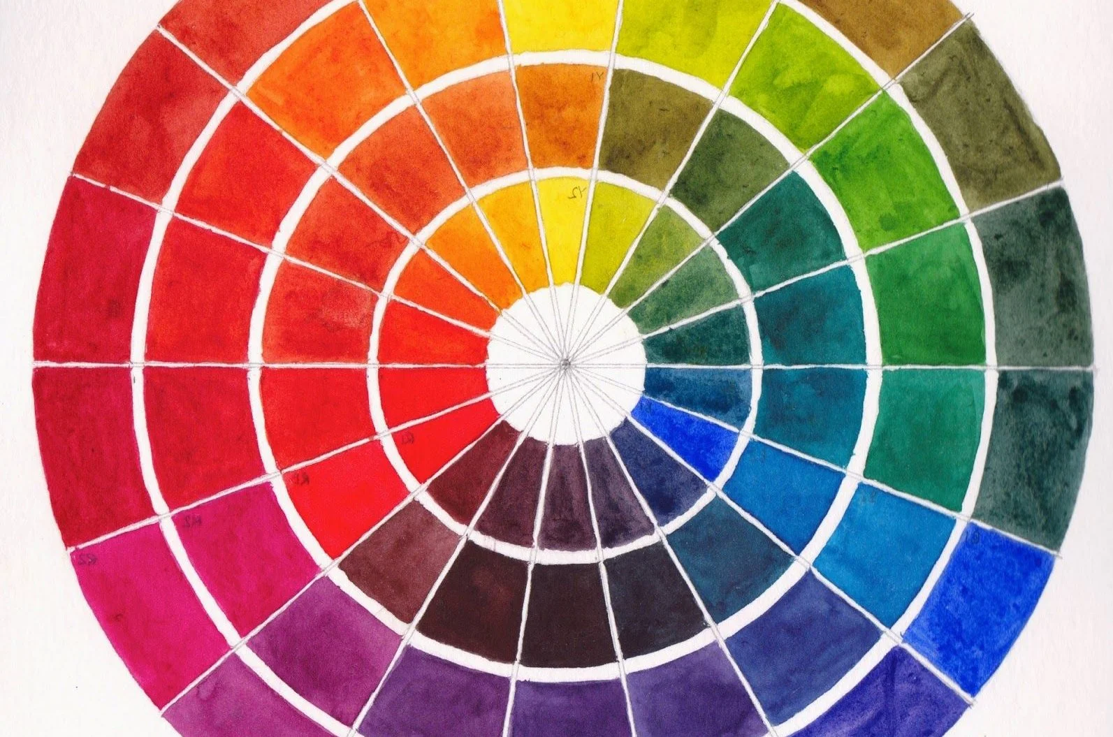
The Foundation of the Colour Wheel: A Primer
Before delving into the importance of understanding the colour wheel, let's take a moment to explore its foundational aspects. The colour wheel is a visual representation of the relationships between colours. It consists of primary, secondary and tertiary colours arranged in a circular pattern. The primary colours—red, blue and yellow—are the building blocks from which all other colours are derived. Mixing these primary colours yields secondary colours—green, purple and orange. Tertiary colours, on the other hand, are achieved by mixing a primary colour with an adjacent secondary colour.
Creating Harmony and Balance
Understanding the principles of the colour wheel is like having a toolbox filled with techniques to create harmony and balance within your artwork or design. Complementary colours, situated opposite each other on the colour wheel (e.g., red and green, blue and orange), create vibrant contrast and energy when placed together. This contrast can be harnessed to draw attention to a specific element or focal point within a composition.
Analogous colours, which sit side by side on the colour wheel (e.g., blue, blue-green and green), evoke a sense of unity and cohesion. Utilising analogous colours in your artwork or design can establish a visually pleasing flow and a sense of natural progression.
Eliciting Emotional Responses
Colours possess an innate ability to evoke emotions and influence perceptions. Red, for instance, can convey passion, love, or urgency, while blue might evoke feelings of calmness, trust, or melancholy. By understanding the emotional connotations associated with different colours, artists and designers can tailor their work to elicit specific responses from viewers.
Enhancing Visual Impact
The colour wheel also plays a crucial role in enhancing visual impact. Gradients and colour transitions can be effectively crafted by selecting colours that lie close to each other on the wheel, resulting in smooth and visually pleasing transitions. Moreover, the concept of warm and cool colours—warm colours being those on the red and orange side and cool colours residing on the blue and green side—can be harnessed to create depth, emphasis and spatial effects within a composition.
Guiding Decision-Making
Art and design are processes that demand thoughtful decision-making. By grounding these decisions in a solid understanding of colour theory, artists and designers can make informed choices that contribute to the overall effectiveness of their work. Whether it's choosing a colour palette for a website, selecting the right shades for a painting, or determining the colours of a brand logo, the principles of the colour wheel serve as a guiding compass.
Conclusion
In the realm of creativity, knowledge is power. Understanding the principles of the colour wheel is akin to mastering a language that speaks to the senses and emotions. It's not just about knowing which colours look good together; it's about harnessing the psychological and visual impact of colours to convey messages, tell stories and create memorable experiences. So, whether you're an aspiring artist, a seasoned designer, or simply someone who appreciates the beauty of visual aesthetics, delving into the world of the colour wheel can open up a universe of creative possibilities.
