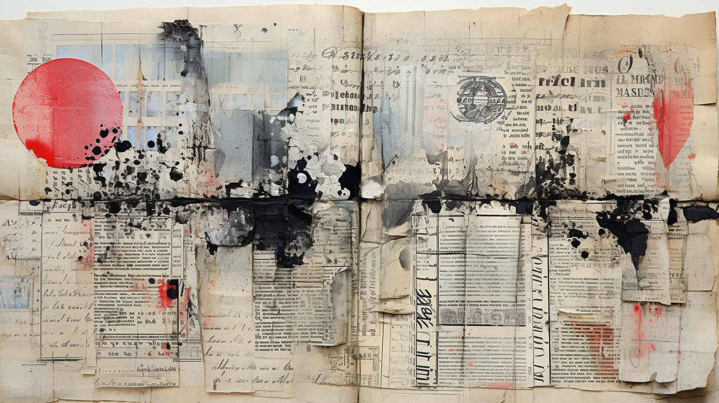
Exploring Symmetry and Asymmetry in Your Art Journal Composition
Art journaling is a deeply personal and expressive form of artistic expression. It provides a unique platform for artists to explore their thoughts, feelings and ideas through a combination of words and visuals. One of the key decisions artists face when creating art journal compositions is whether to embrace symmetry or asymmetry in their designs. In this blog post, we will delve into the concepts of symmetry and asymmetry in art journaling and explore how you can use them to enhance your creative process.
Symmetry: Finding Balance
Symmetry is a design principle that involves mirroring elements in a composition. It creates a sense of balance and harmony, offering a feeling of order and stability in your art journal pages. Here's how you can incorporate symmetry into your compositions:
Bilateral Symmetry: This is the most common form of symmetry. Imagine folding your page in half and each side mirrors the other. You can achieve this by using identical shapes, colors, or motifs on both sides of the fold.
Radial Symmetry: In this approach, elements radiate out from a central point, creating a circular or star-like design. This can be a striking choice for journal covers or as a focal point within your pages.
Reflective Symmetry: Reflective symmetry involves creating a sense of balance by placing similar elements on either side of an imaginary axis. This can be done with text, images, or even colors.
Using symmetry in your art journal can be particularly effective when you want to convey a sense of order, stability, or contemplation. It's a great choice for introspective and reflective journal pages.
Asymmetry: Embracing Creative Freedom
On the other hand, asymmetry involves creating compositions where elements are not mirrored or evenly distributed. Asymmetry can introduce a dynamic and unpredictable quality to your art journal pages, making them feel more spontaneous and expressive. Here's how to play with asymmetry:
Creating Focal Points: Asymmetry allows you to create strong focal points by placing a dominant focal element off-center. This draws the viewer's attention and can be used to emphasize the most important aspects of your journal page.
Dynamic Layouts: Experiment with placing elements at various angles and positions on the page. This can result in a more dynamic and energetic composition, which can be perfect for expressing passion, anger, movement, or chaos in your art journal.
Contrast and Imbalance: Asymmetry invites you to embrace contrast and imbalance in your compositions. Use different colors, shapes and textures to create tension and evoke specific emotions in your art journal composition.
Balancing Symmetry and Asymmetry
The beauty of art journaling is that there are no strict rules to follow. You can choose to embrace symmetry, asymmetry, or even a combination of both in your compositions. Sometimes, the most captivating pages are those that strike a delicate balance between the two.
Here are a few tips for combining symmetry and asymmetry in your art journal:
Start with a Foundation: Begin with a symmetrical base and then introduce asymmetrical elements to disrupt the balance subtly.
Use Negative Space: Experiment with the space around your elements. Negative space can create a sense of asymmetry while still maintaining overall balance.
Embrace Intuition: Let your emotions and instincts guide your choices. Sometimes, the best compositions emerge when you go with the flow and allow your journal to become a reflection of your inner intuitive world.
Conclusion
Whether you prefer the structured elegance of symmetry or the vibrant energy of asymmetry, both design approaches have their place in art journaling. The key is to understand how each can serve your creative intentions. Symmetry offers stability and order, while asymmetry invites spontaneity and strong emotion.
Ultimately, the decision between symmetry and asymmetry in your art journal composition is a deeply personal one. It's an opportunity to express your unique perspective and emotions. So, as you embark on your journaling journey, remember to embrace both these design principles and don't be afraid to push the boundaries of your creativity.
Your journal is a reflection of your inner world, the way you choose to use symmetry and asymmetry can make it truly special and truly personal.


